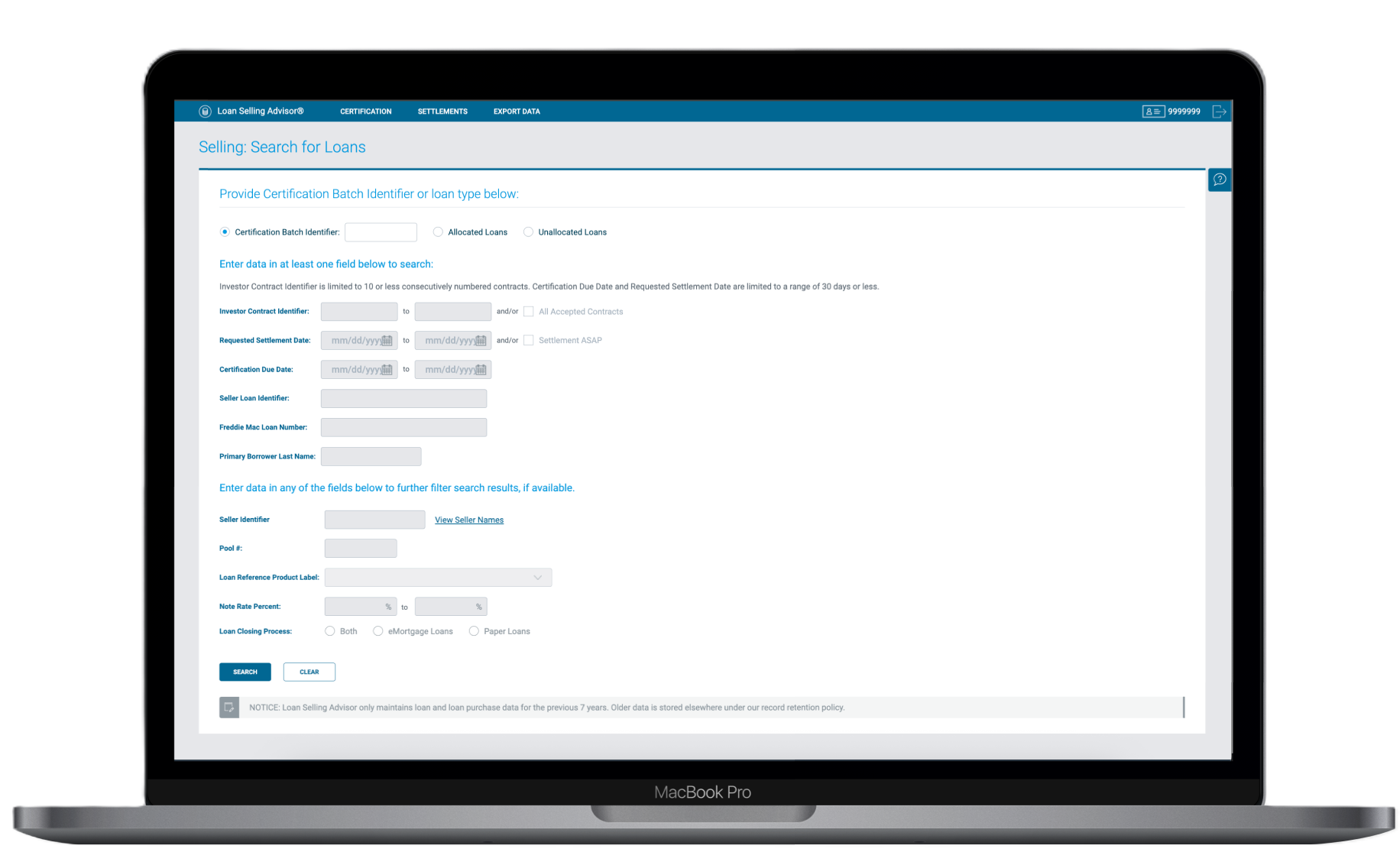
One of seven legacy screens - each requiring separate navigation to manage a single loan's different states
Consolidating 7 duplicate screens into one dynamic interface, eliminating 5–10 second filter delays and reducing cognitive load for custodians managing hundreds of loans daily.
In 2023, Freddie Mac initiated a full-scale modernization effort to overhaul Loan Selling Advisor - a core platform used by lenders such as banks and mortgage companies to manage the process of selling loans to Freddie Mac. At the heart of this platform was the document custodian workflow: a critical hub where custodians are responsible for managing, verifying, and certifying hundreds of loans every single day.
I joined as the Lead UX Designer, tasked with redesigning the custodian workflow from the ground up. The existing system was characterized by redundant interfaces, slow search capabilities, and a high cognitive load that actively hindered custodians from performing their tasks efficiently. Every unnecessary click or delayed page load compounded across hundreds of daily interactions, resulting in severe bottlenecks.
The legacy architecture forced users to navigate across 7 duplicate screens just to manage different states of a loan. This redundancy confused users and created a massive maintenance burden; the development team had to update 7 different codebases for a single feature enhancement.
Compounding this were severe performance problems. Custodians frequently toggled between data and documentation issues, requiring constant filter adjustments. Every filter change triggered a 5–10 second full-page reload, a penalty that, multiplied across hundreds of daily interactions, resulted in significant lost productivity and workflow frustration.
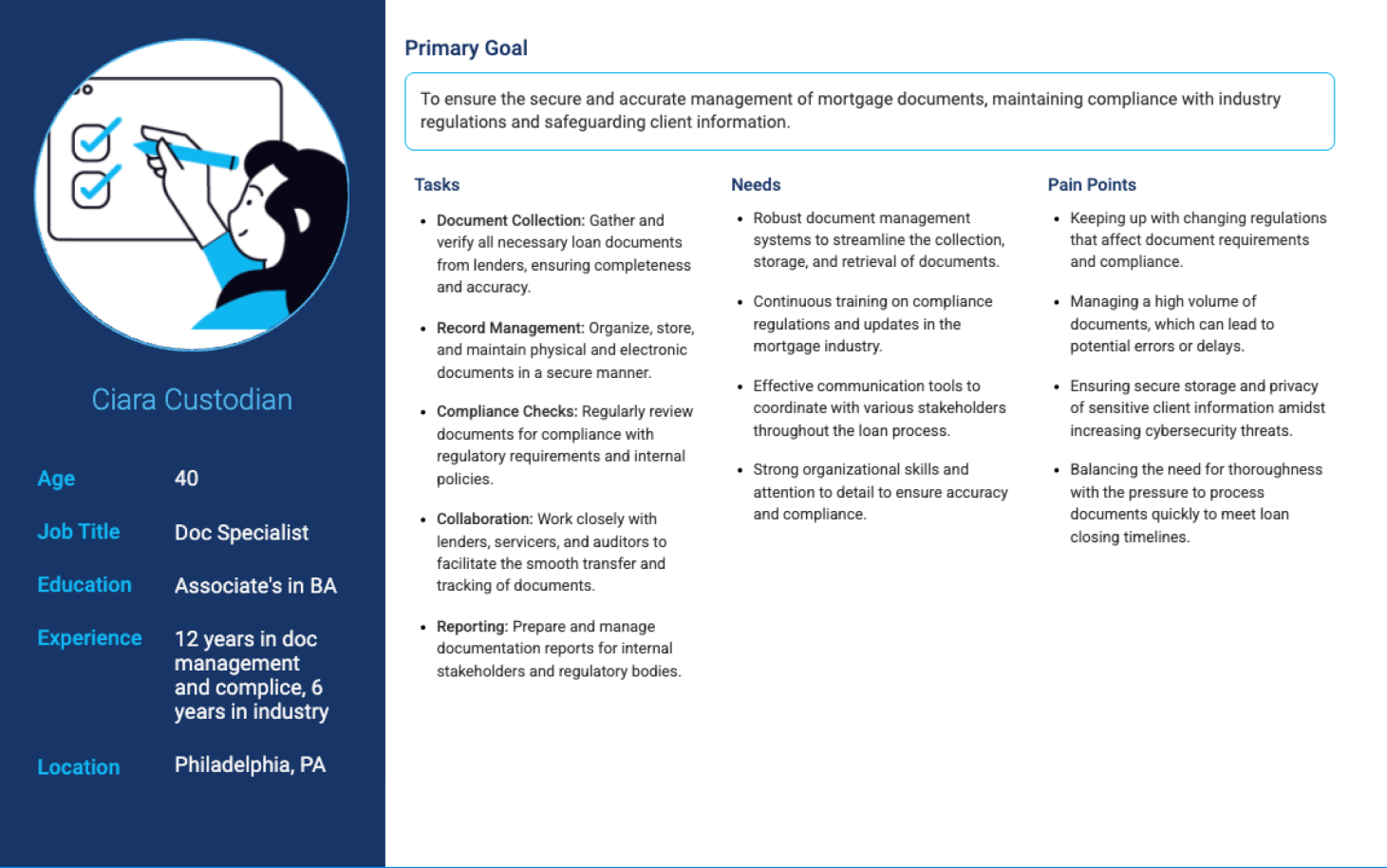
To design a solution that truly resonated with our users, I initiated a deep-dive research phase, partnering directly with custodians. Through contextual inquiry and shadowing sessions, I observed their daily routines, noting exactly where they hesitated, where they created workarounds, and where the system actively blocked their progress.
"Out of the dozens of columns in the tables, we only really use a few for decision making."
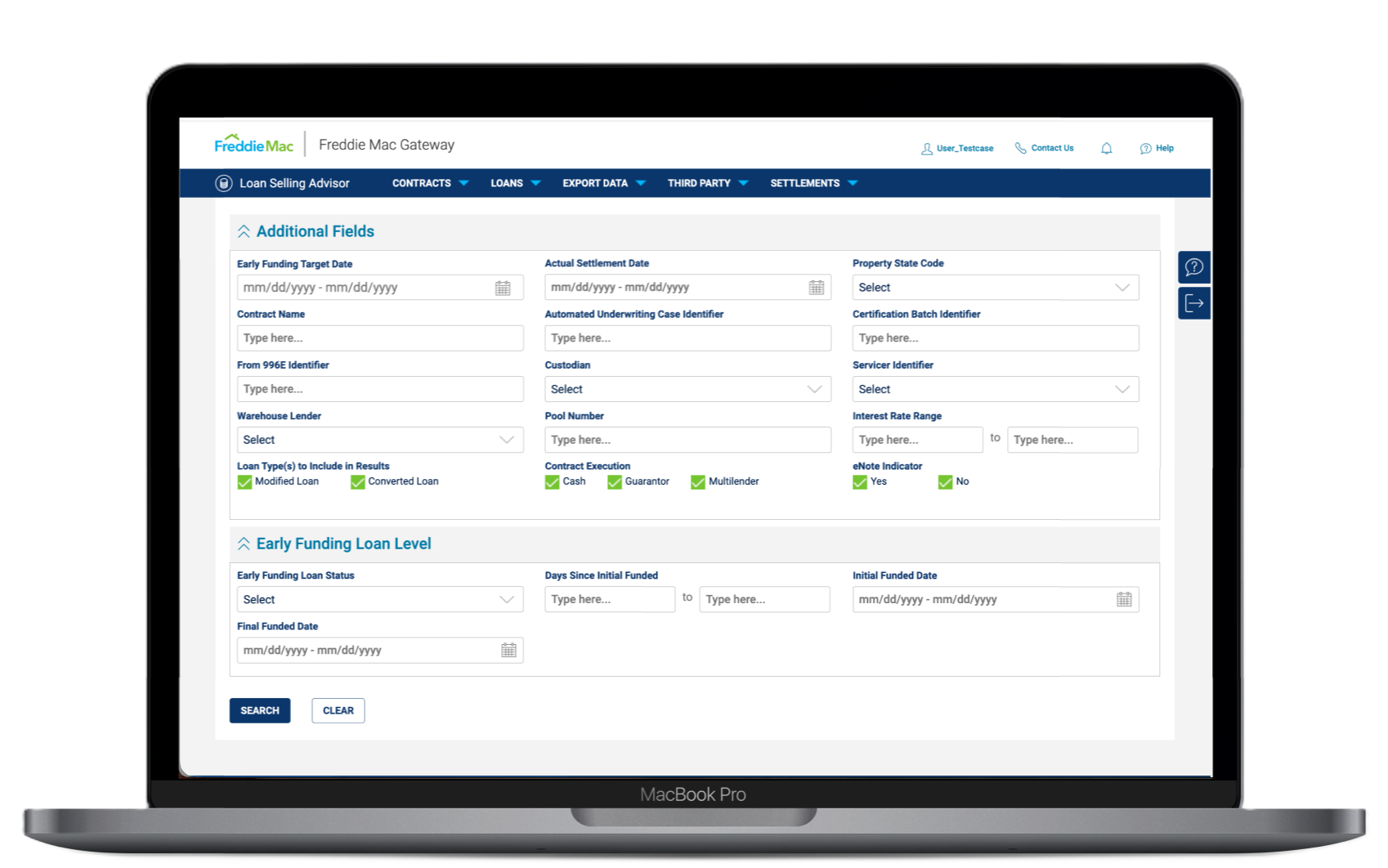
We conducted field prioritization exercises with custodians to understand which data points were actually necessary for immediate tasks. We drew a hard line between "essential for initial review" and "needed for deep investigation", which became the foundation for the new information architecture.
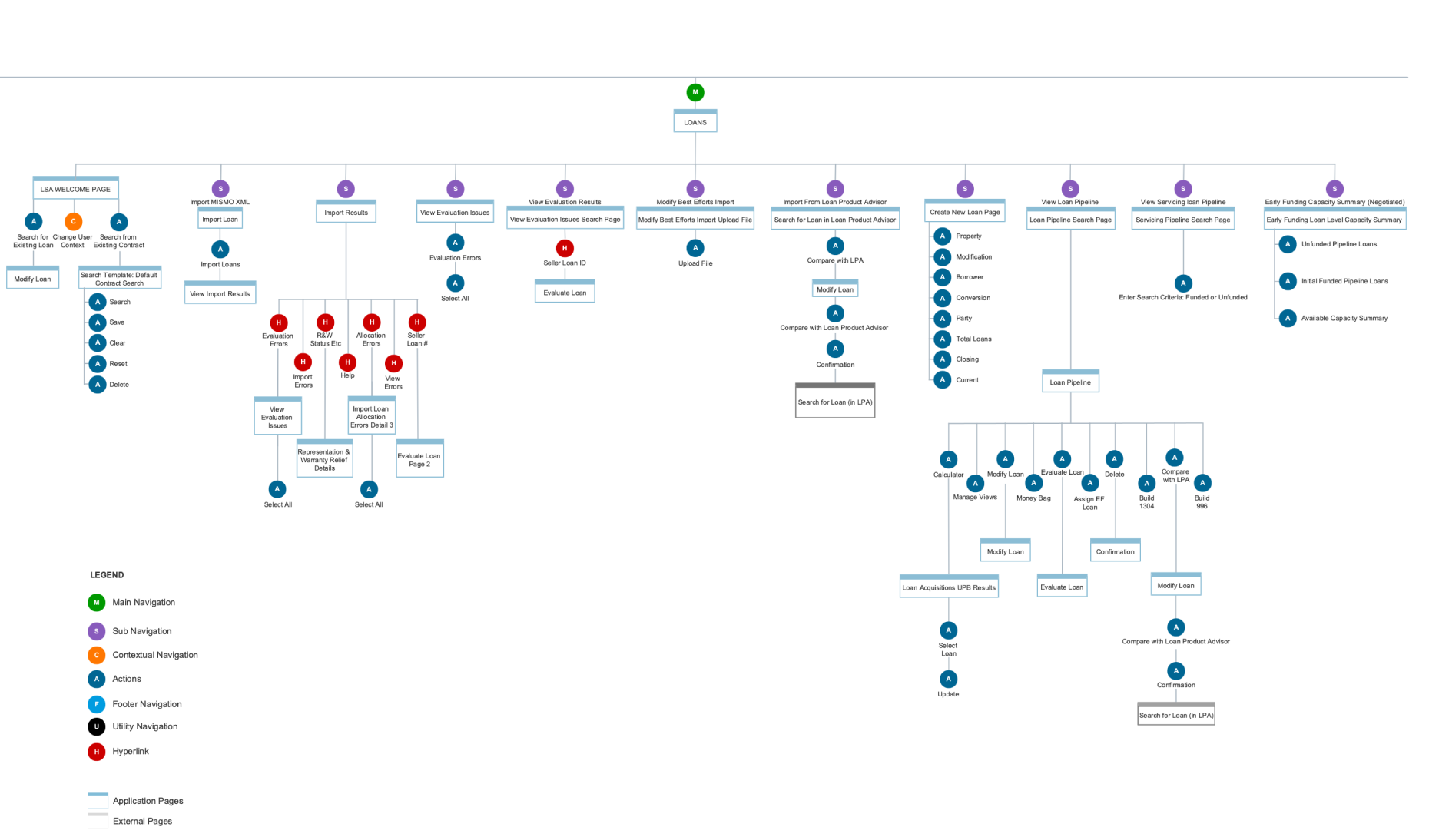
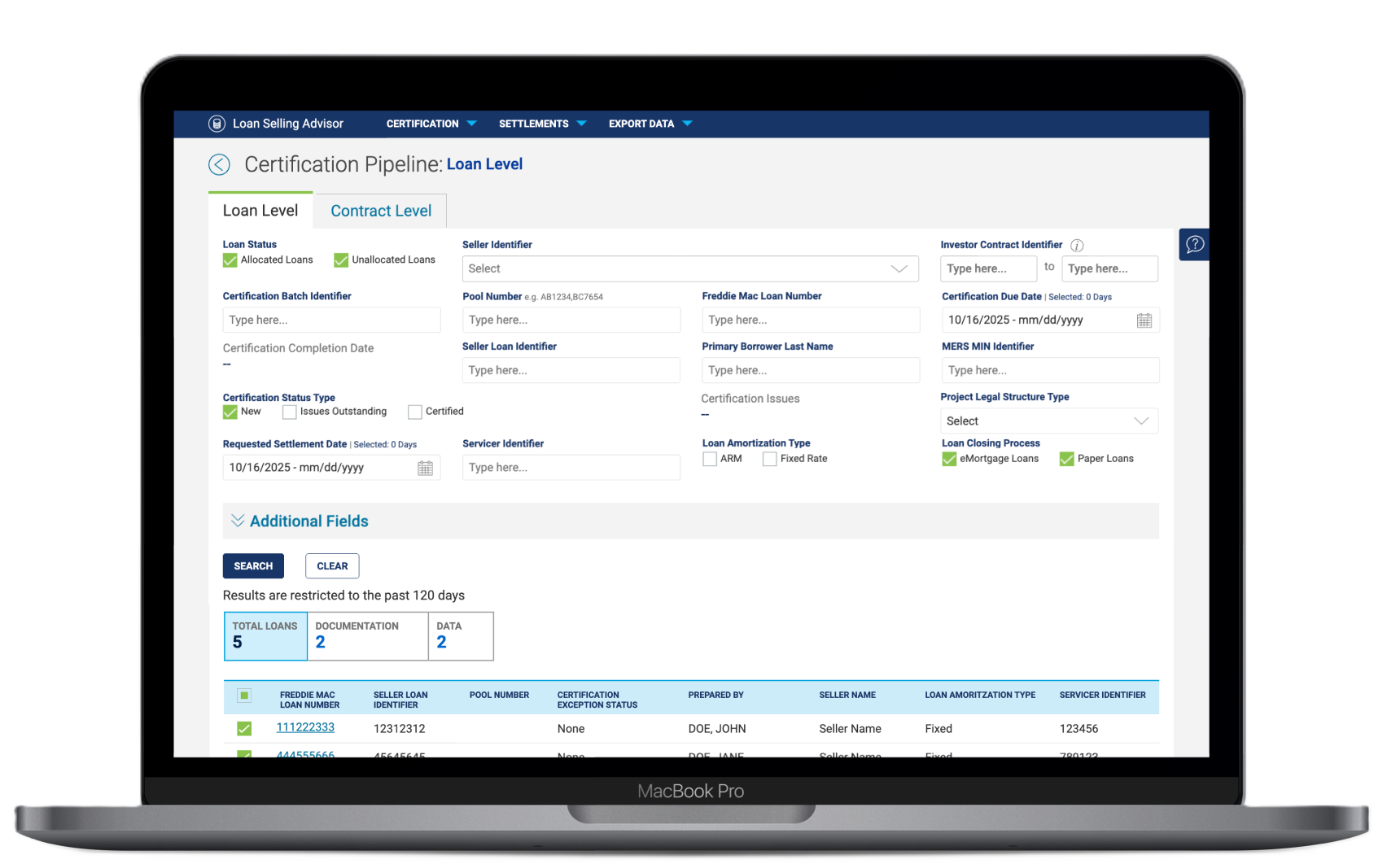
The most critical shift was addressing the 7 duplicate screens. Through iterative wireframing, I explored how to condense these distinct views into a single dynamic layout. By decoupling the UI from rigid legacy backend states, we designed a framework where the interface contextualizes itself based on loan status, rather than forcing the user to navigate to a new page.
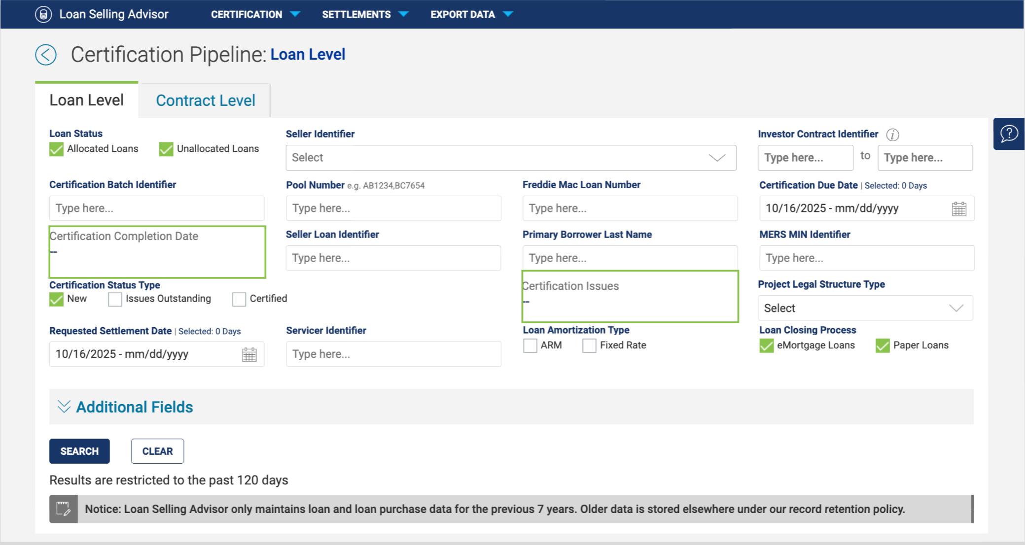
The seven screens were separated based on Loan level and Contract level, with fields dynamically swapping between active and inactive states based on Loan Status and Certification Status selection. Removing 6 redundant screens also significantly reduced the developer maintenance overhead for every future feature enhancement.
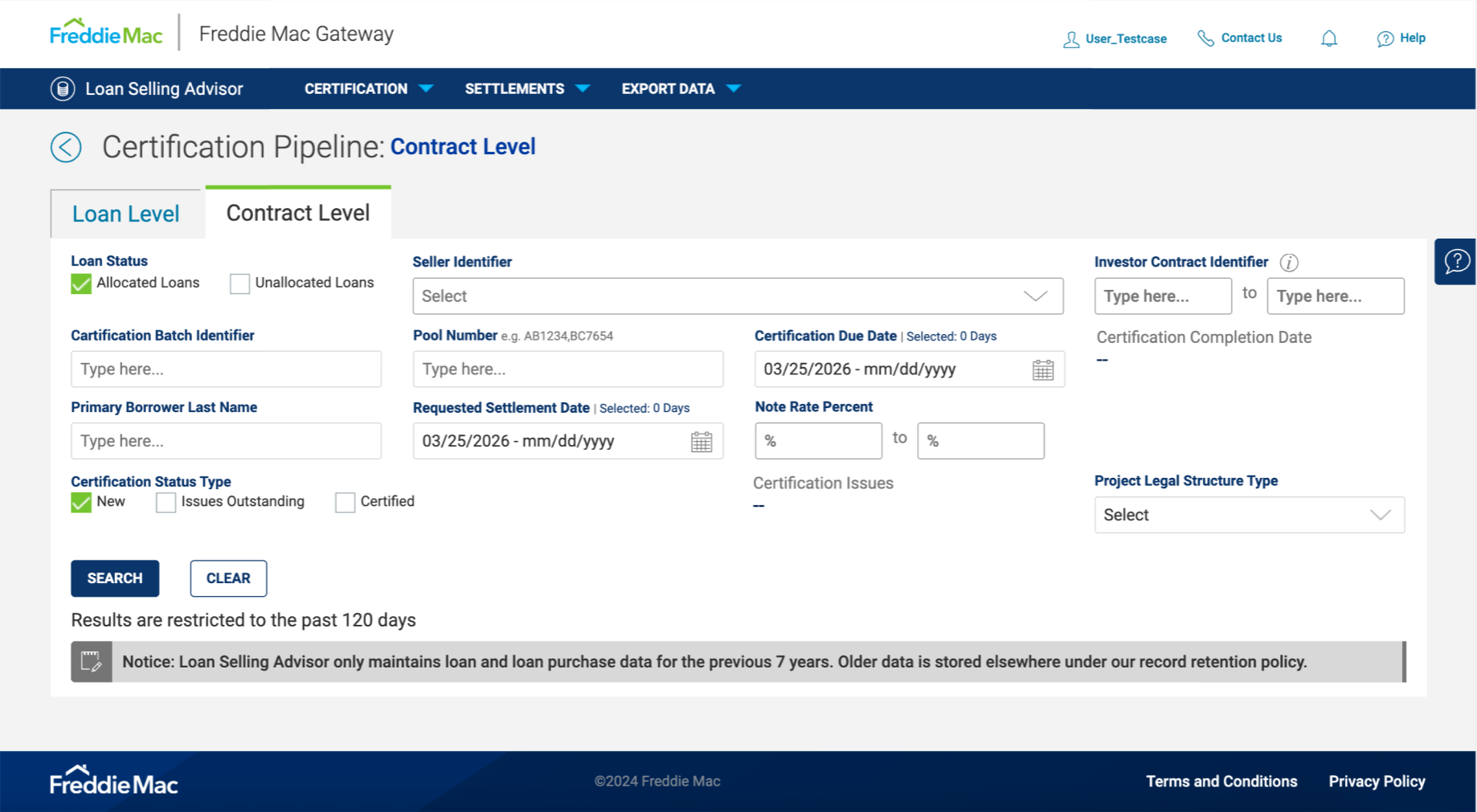
With the architecture simplified, I focused on the most painful interaction points: search and filtering. The legacy search required users to type full queries, hit enter, and manually scroll through results. I replaced this with a robust type-ahead search component - as users type, the system instantly surfaces relevant loans, eliminating the need for manual scrolling entirely.
I then tackled the debilitating reload times. Because custodians frequently pivot between resolving data errors and documentation errors, they needed a way to segment their view instantly. The new Quick Filter mechanism allows toggling seamlessly between "Total Loans," "Documentation," and "Data" , with front-end filtering logic that entirely bypasses the 5–10 second server-side wait.
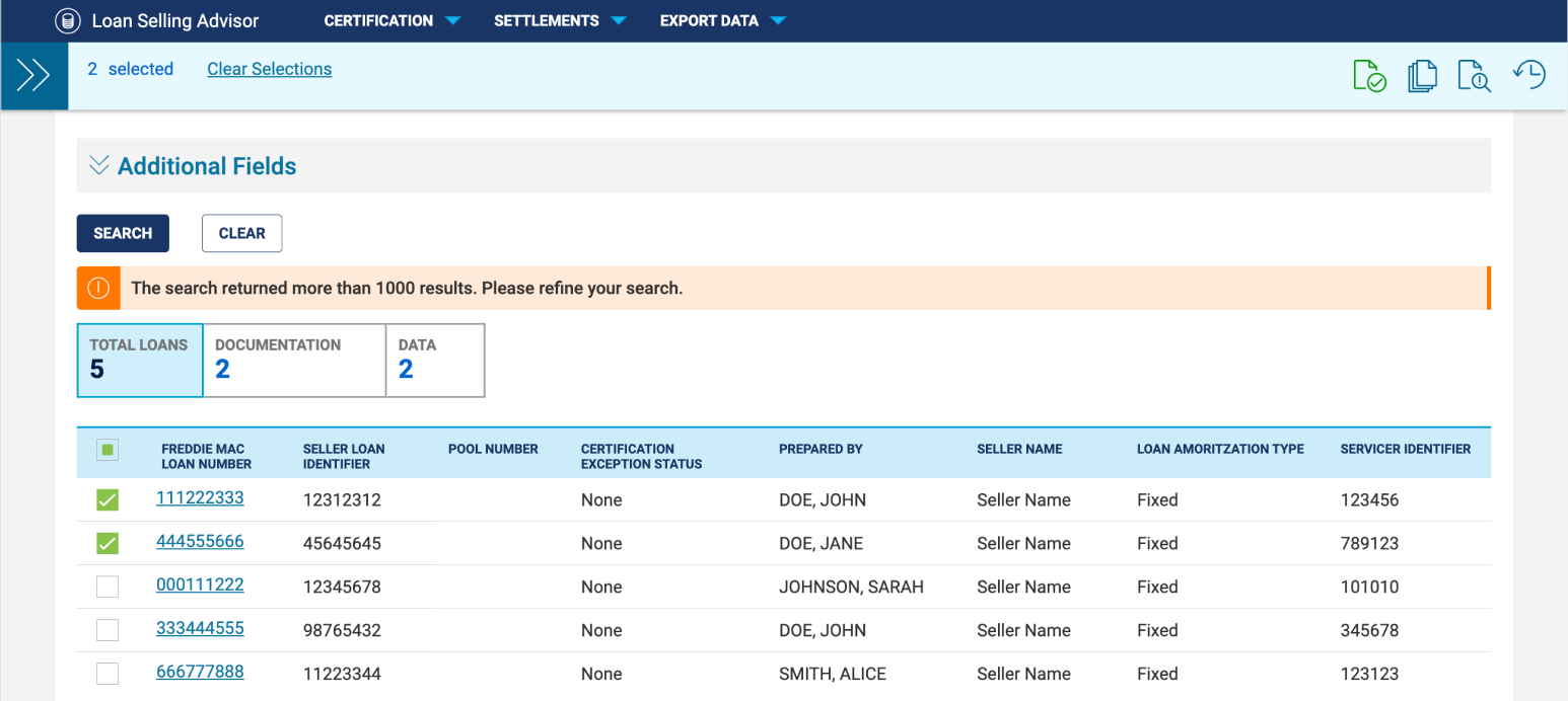
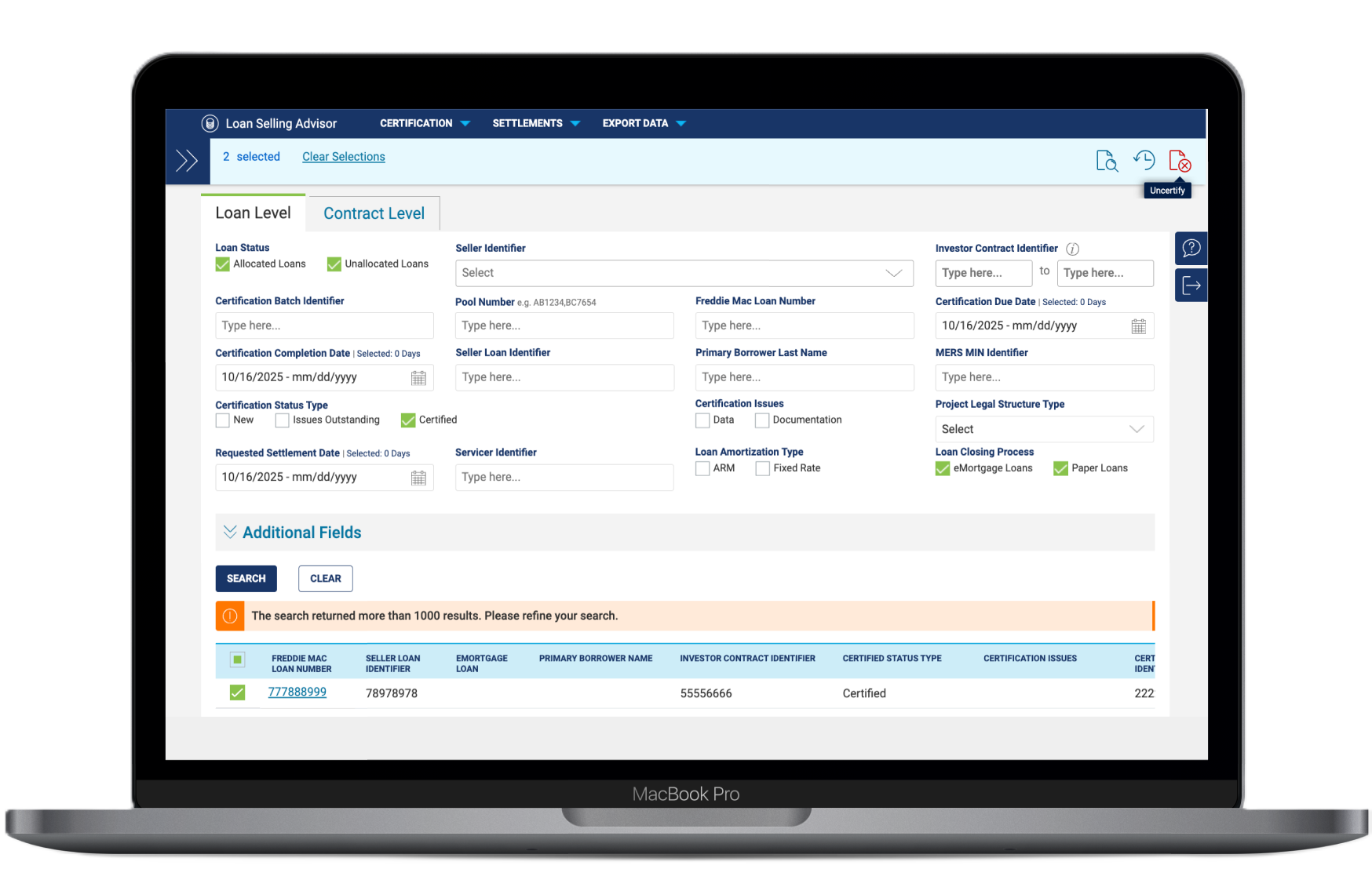
Custodians rarely work on a single loan in isolation -- high-volume batch processing is the reality of their workflow. The legacy system buried multi-loan certification deep within one of the seven screens, making it difficult to discover. Users often had to select loans, navigate away from their list, perform an action, then navigate back.
We leveraged the new bulk action slider component from the design system, housing all actions in an accessible, always-visible location. This eliminated the need to navigate away from the primary data table. Available actions now correspond contextually to the active filter selection, with tooltips on hover to surface each function.
Following the redesign and release of the Document Custodian Pipeline, we surveyed users to assess ease-of-use and areas of opportunity. The results were strong across every measure, particularly around speed and discoverability, the two areas of highest friction in the legacy system.
On the engineering side, removing 6 redundant codebases reduced the overhead for every future feature enhancement; a structural win that compounds with each subsequent release cycle.