Case Study, Freddie Mac

50% Faster: Redesigning Freddie Mac's Loan Pipeline for High-Volume Lenders

Redesigning how lenders manage thousands of loan records across a brittle, decade-old platform; cutting evaluation time in half, reducing filter errors by 40%, and giving high-stakes financial users the visibility and confidence to act without second-guessing the system.

Company
Freddie Mac
Role
Lead UX Designer
Timeline
2023 – 2026 (ongoing)
Team
Product, Engineering, Business Stakeholders

A platform that outlived its foundations

Loan Selling Advisor is Freddie Mac's core marketplace tool for lenders to sell and securitize loans. Built in 2016 without strong UX foundations, it had grown brittle over nearly a decade. Workflows were slow. Data visibility was weak. Users often felt they were fighting the system rather than working with it.

In 2023, Freddie Mac committed to a full modernization of the loan pipeline experience. My role: lead the UX design of the pipeline module; redesigning how lenders manage thousands of loan records, streamline decision-making, and reduce operational risk across a highly regulated financial environment.

The design problem was not about making things look better. It was about making things reliable, fast, and transparent in an environment where any inefficiency or error translates directly into cost, risk, and reputational exposure.

Legacy Loan Selling Advisor pipeline
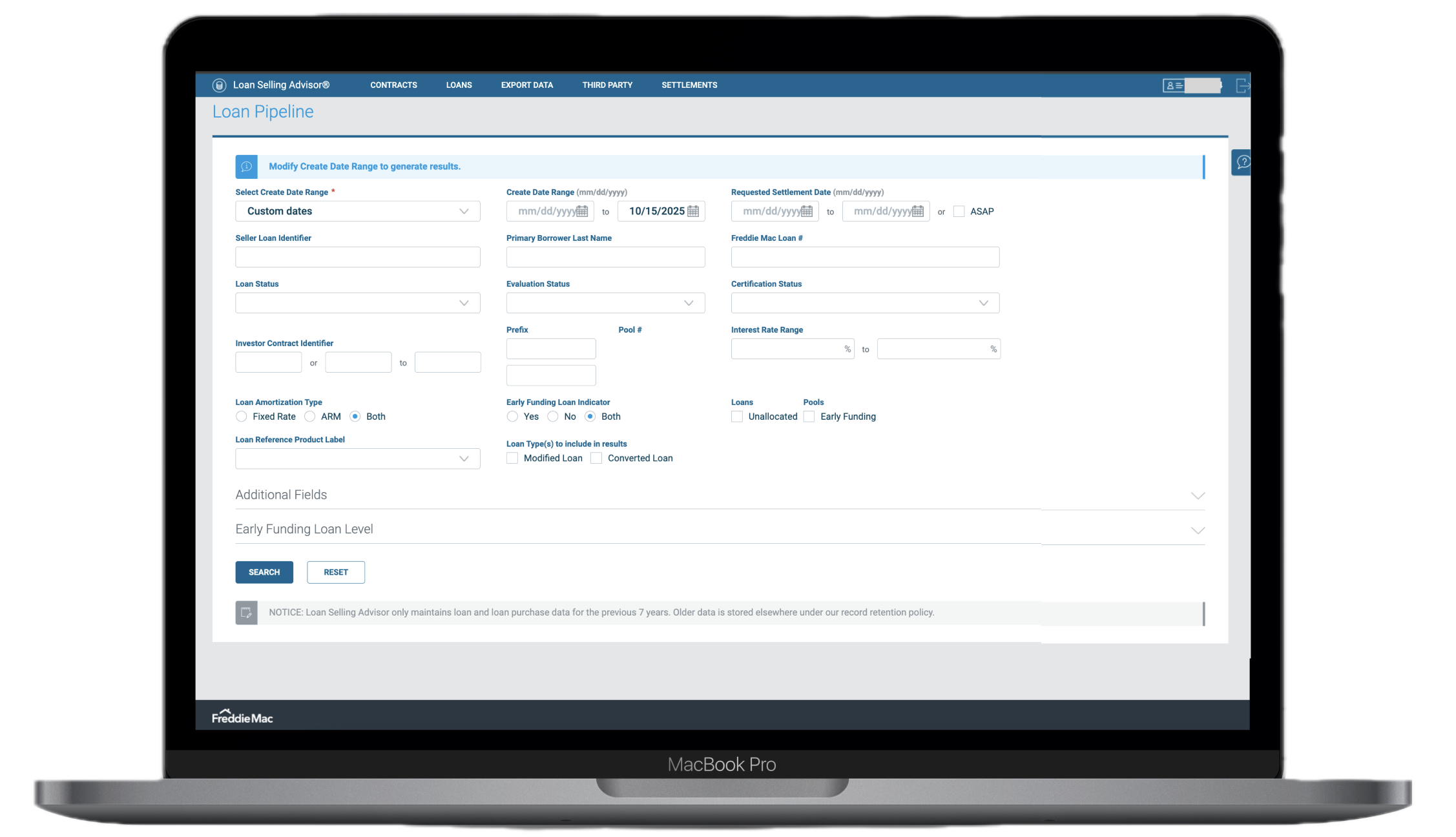
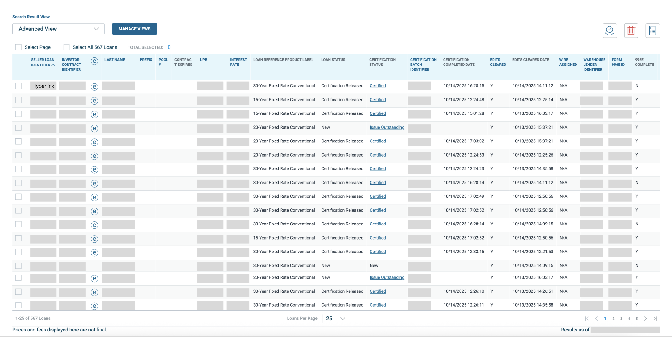
The legacy Loan Selling Advisor pipeline; 15 filters, no real-time feedback, and a workflow that forced users to start over on errors

Three compounding failures

7 min
To evaluate a single loan
The legacy workflow required multiple steps, no feedback, and frequent restarts due to errors.
15
Filters, only 3 regularly used
The rest created noise and decision overhead, slowing users down without adding value.
Zero
Pre-execution feedback
No preview of financial or pooling impact before confirming bulk actions, leading to costly errors.

The legacy pipeline forced users into a frustrating loop: apply filters, drift out of context, execute a bulk evaluation, receive an error, and start over. Support ticket analysis confirmed what users were already saying; most errors stemmed from filter-action state misalignment and a complete lack of preview before high-stakes actions were confirmed.

For lenders managing high-value transactions at scale, this was not a usability inconvenience. It was operational risk.

Legacy results table with buried actions
The actions are buried above the table and were hard for the users to understand

Seeing the workflow at scale

We started by mapping the full pipeline flow from loan ingestion through filtering, evaluation, pooling impact, and bulk action execution. From there I initiated direct research with both internal and external lender personas through user interviews and journey mapping.

User interviews revealed that most users relied on just 3 of the 15 available loan-status filters. The rest were noise; adding cognitive load without adding value. Journey mapping exposed the recurring failure pattern: users applied filters, lost context mid-task, executed actions, hit errors, and were forced to restart from scratch.

"For financial users working at scale, visibility of data and predictability of outcomes matter more than anything else. Users needed to see what will happen before they committed."

A key insight emerged from support-ticket analysis: many errors stemmed specifically from filter-action state misalignment. Users would set up a filtered view, get pulled into a different task, and execute bulk actions without realizing their context had shifted. The system gave them no way to verify what they were about to do before doing it.

Journey map and research artifacts
Journey mapping exposed the recurring failure loop; filter, drift, execute, error, restart

Reduce decision latency, eliminate re-work, embed risk-awareness early

Our north star was straightforward: give users confidence before they act, not consequences after. I charted the legacy pipeline flow end to end, identifying every decision node, redundancy, and error state generating the most friction, then scoped an MVP targeting the highest-frequency pain points first.

01
Map
Charted the full legacy pipeline flow from loan ingestion through filtering, evaluation, pooling impact, and bulk action execution. Highlighted every decision node and error state.
02
Prioritize
Collaborated with business stakeholders and lender representatives to rank workflows by volume and impact. Scoped the MVP around the highest-frequency pain points.
03
Build
Used Figma to rebuild the UI as a modular component system; reusable tables, filter modules, a pinned bulk-action bar, and real-time feedback components aligned with enterprise design conventions.
04
Prototype & Test
Low-fidelity flows in JustInMind validated the major redesign hypotheses. High-fidelity interactive prototypes in Figma were tested with internal and external users. Tracked task time, error rate, and comprehension of financial feedback.
05
Hand Off
Worked closely with the front-end team to translate interaction patterns into Angular components. Aligned on tokens, states, edge cases, and performance constraints throughout.
Redesigned pipeline prototype
The redesigned Loan Pipeline; simplified filters, pinned bulk-action bar, and real-time aggregation feedback before execution

Five changes that changed everything

Pinned bulk-action bar
Even while scrolling thousands of records, users always have immediate access to evaluate or pool actions. No more hunting for controls buried below the fold, and no more losing context between selecting loans and acting on them.
Quick-status filters
The three most-used statuses are now surfaced as one-click options. The filter panel is simplified; the decision overhead is gone. Users can segment their view in a single click instead of navigating a panel of 15 options.
Simplified search and filter layout
Fields reorganized by business relevance: Loan ID, UPB, Note Rate, Delivery Status. Related filters grouped. White space applied. Scanning a list of thousands of records became something users could actually do without losing their place.
Real-time aggregation feedback
As users apply filters or select loans, totals and pooling-impact estimates update immediately before they confirm execution. Users can see what is about to happen. That single change eliminated a significant share of the error volume.
Role and permission clarity
Inline indicators show what the current user can and cannot do. No more confusion about why an action is unavailable, and no more delays caused by users attempting actions outside their permission level.
Redesigned pipeline final design
The redesigned Loan Pipeline; pinned bulk-action bar, simplified filter panel, real-time aggregation feedback, and role clarity indicators

Half the time, record preference

50%
Reduction in loan evaluation time
From 7 minutes to 3.5 minutes per loan
40%
Reduction in filter-related errors
Following launch in production
30%
Reduction in new user training time
Onboarding to the redesigned platform
9/10
Users preferred the new interface
In usability testing vs. the legacy system

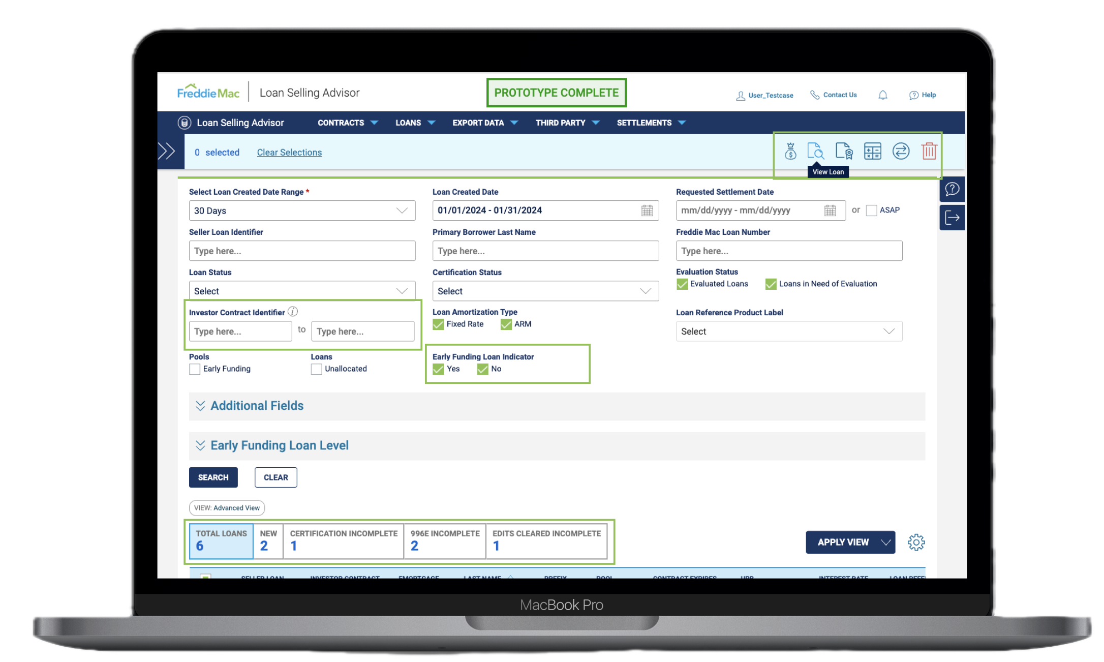
The redesign is now live in production and rolling out across the full LSA user base. It has improved operational efficiency, reduced support volume, and given lenders confidence in their actions within a system where a wrong move carries real financial consequences.

Designing for a high-stakes financial environment reinforced something I carry into every project: reliability and clarity are the foundations of trust. The most meaningful design decisions here were not about visual polish. They were about reducing friction, improving visibility, and making users certain before they act.

Phase 2 launches in 2026; refining visual hierarchy, extending the component library across other LSA modules, integrating live analytics dashboards, and targeting an additional 20% reduction in time-to-action.

Next case study
HappyCow Redesign