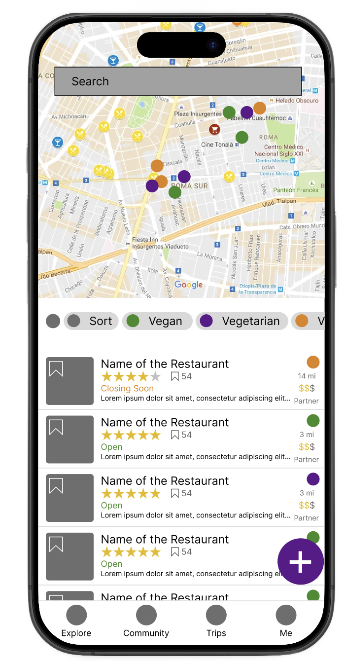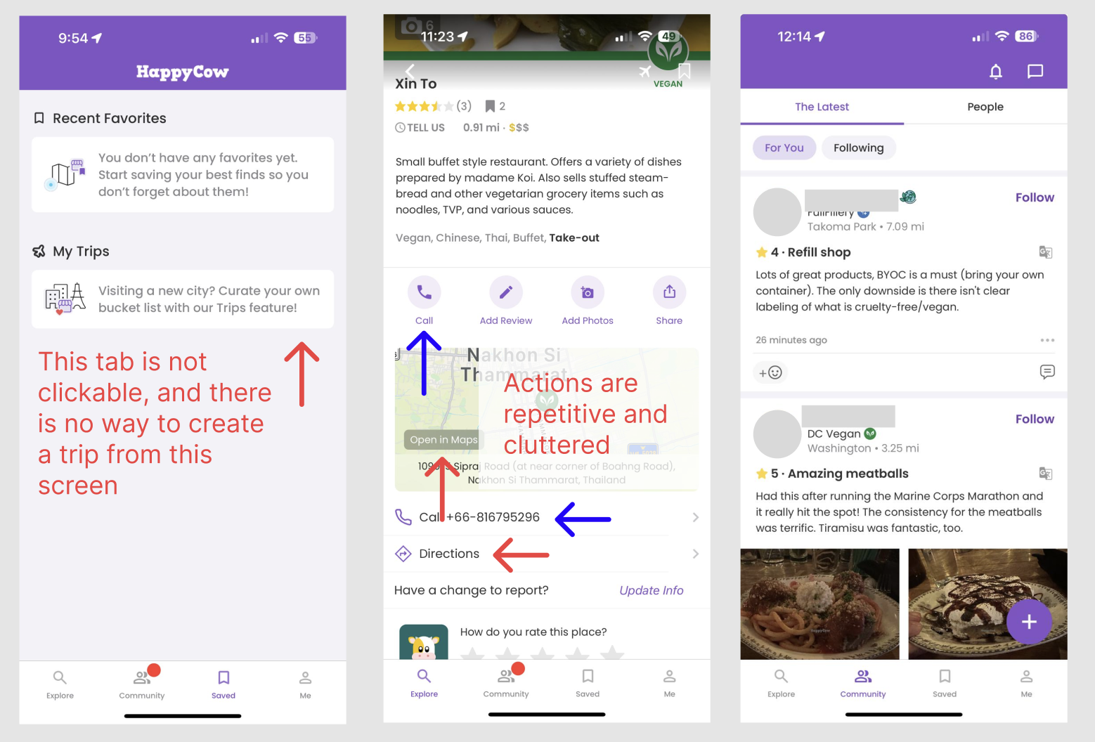
The legacy interface; Trips buried under "Saved," duplicate map and call elements, no dietary context surfaced inline
HappyCow is where plant-based travelers go to find restaurants they can actually eat at. The community is active and the listings are good. But the app's trip planning feature, Trips, was almost impossible to find, and when users did find it, it didn't tell them what they actually needed to know. This project rethought the Trips experience from the ground up.
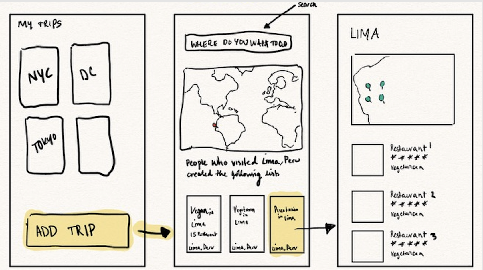
HappyCow had a trip planning feature. Most of its users had no idea. Trips was buried two taps deep inside a tab called "Saved," which is not where anyone looks when they're trying to plan a vacation. So instead of using it, people were piecing together their itineraries across Google Maps, Reddit, and random travel blogs.
The bigger issue was trust. "Vegetarian" means different things in different countries, and users knew it. Before sitting down at any restaurant abroad, they were spending 5 to 10 minutes on forums trying to figure out whether the local definition of vegetarian would actually cover their restrictions. HappyCow was perfectly positioned to solve this. It just wasn't.
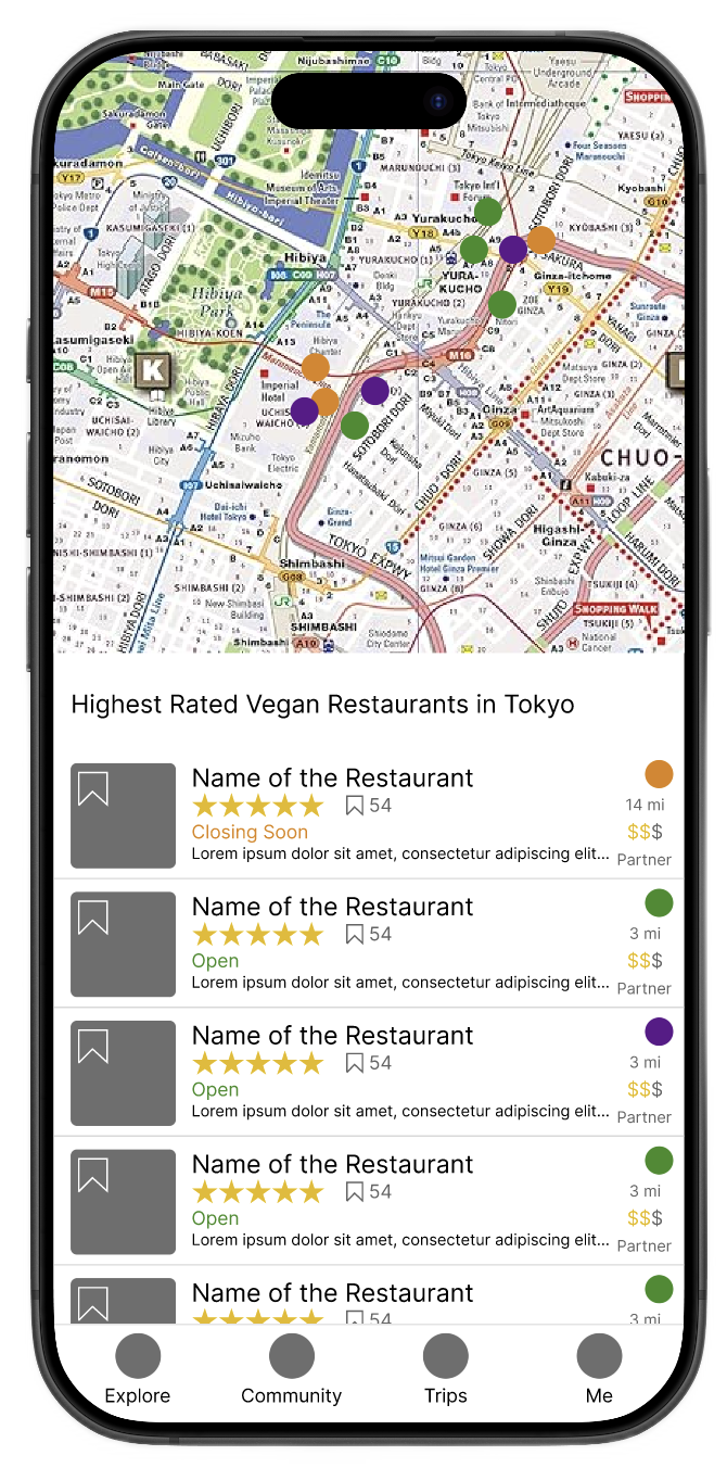
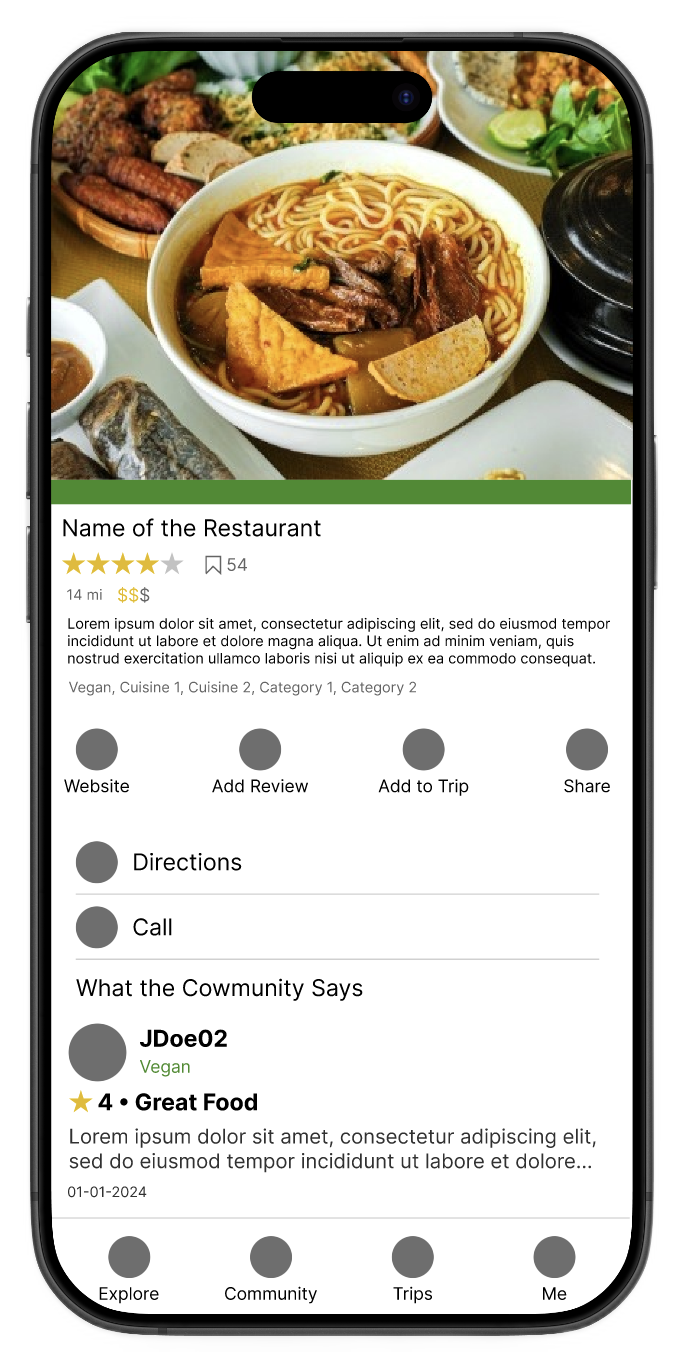
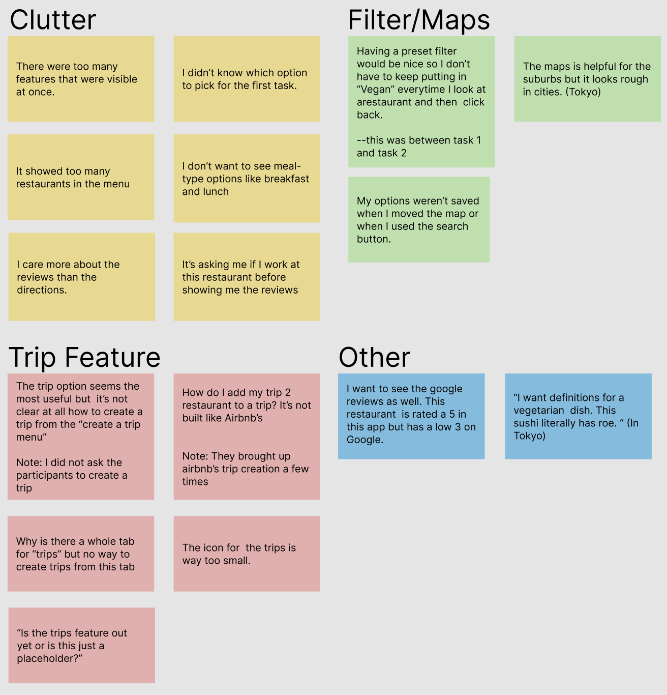
On top of that, the restaurant screen itself was cluttered. There were duplicate phone buttons, multiple map instances, and filters that reset every time you panned the map. Small things, but they added up. Users were doing a lot of work the app should have been doing for them.
I ran a 41-person survey and sat with 4 participants for think-aloud sessions. The survey gave me numbers; the sessions showed me what it actually felt like to use the app when you're trying to plan a trip.
Nobody could find Trips on their own. They looked in the right general area but "Saved" just didn't read as a planning tool. When I asked participants where they expected to find trip planning, they pointed to the bottom nav every time.
"Dietary term definitions vary significantly by region. 'Vegetarian' in parts of South America may include lard; in India it typically excludes eggs. Users had no way to know this from inside the app, so they left to find out."
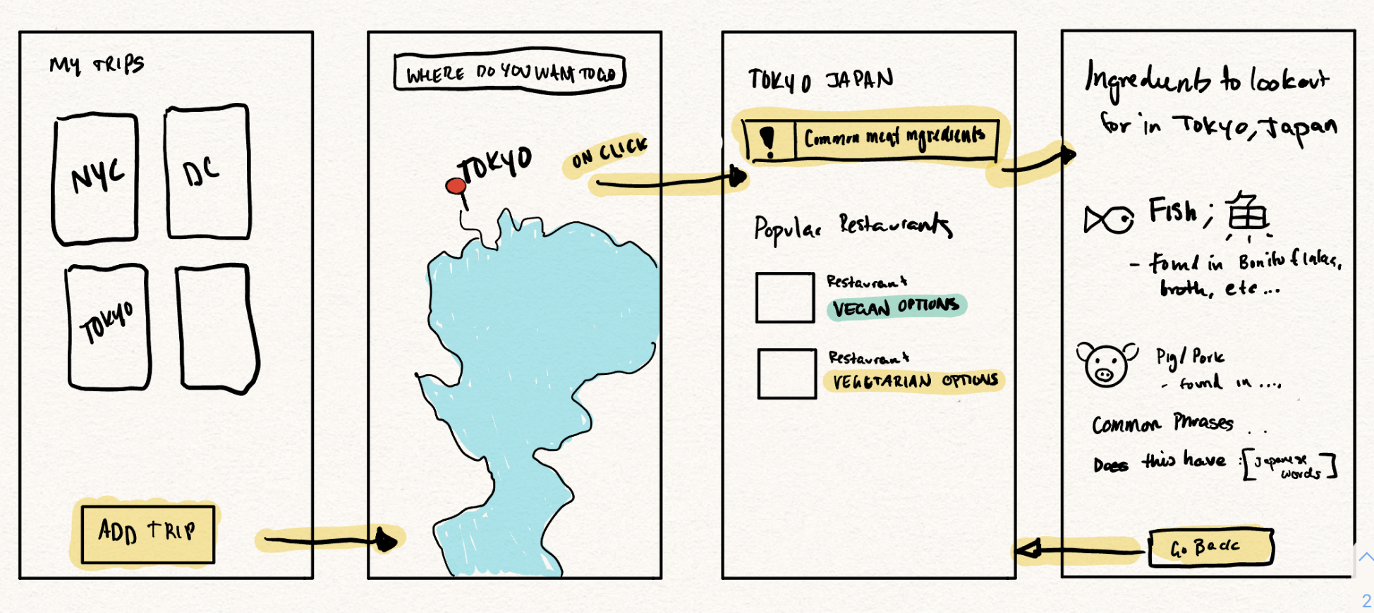
The finding that stuck with me most: people wanted the app open at the table, not just before they left the hotel. They were using it to double-check things mid-meal, to show the waiter, to look up what was actually in a dish. But the app had nothing for that moment. It ended at the search results page.
I kept the process tight. Each stage was meant to answer a specific question before moving forward.
None of these were arbitrary. Each one came directly out of something I saw in research.
What I took away from this project was how much the context of use matters. These users weren't at a desk. They were on the street, at a table, in a country where they didn't speak the language. An app that only helps you before you leave the hotel is only doing half the job. The dietary nuance problem wasn't a content problem; the knowledge was already there in the community. It was a surfacing problem.
If I had more time, offline mode and trip-sharing would be first. Both solve a real problem: you're abroad, your data is expensive, and you're trying to use an app that requires a connection.